


In a digital age dominated by information overload, visual content has become the secret sauce for effective communication. Among various visual aids, comparison infographic templates stand out as powerful tools for conveying complex messages in a simple and engaging manner.
Understanding Comparison Infographics
Comparison infographics, at their core, are visual representations that juxtapose different elements to highlight similarities and differences. Their purpose extends beyond mere aesthetics; they serve as compelling storytelling devices, making data more accessible and memorable.
Additionally, when creating comparison infographics, it’s essential to use colors that not only capture attention but also maintain a cohesive and organized look. One tool that greatly simplifies this process is PhotoADKing’s infographic maker. With its user-friendly interface and a myriad of customizable templates, this infographic maker allows users to seamlessly experiment with various color schemes.
Types of Comparison Infographic Templates
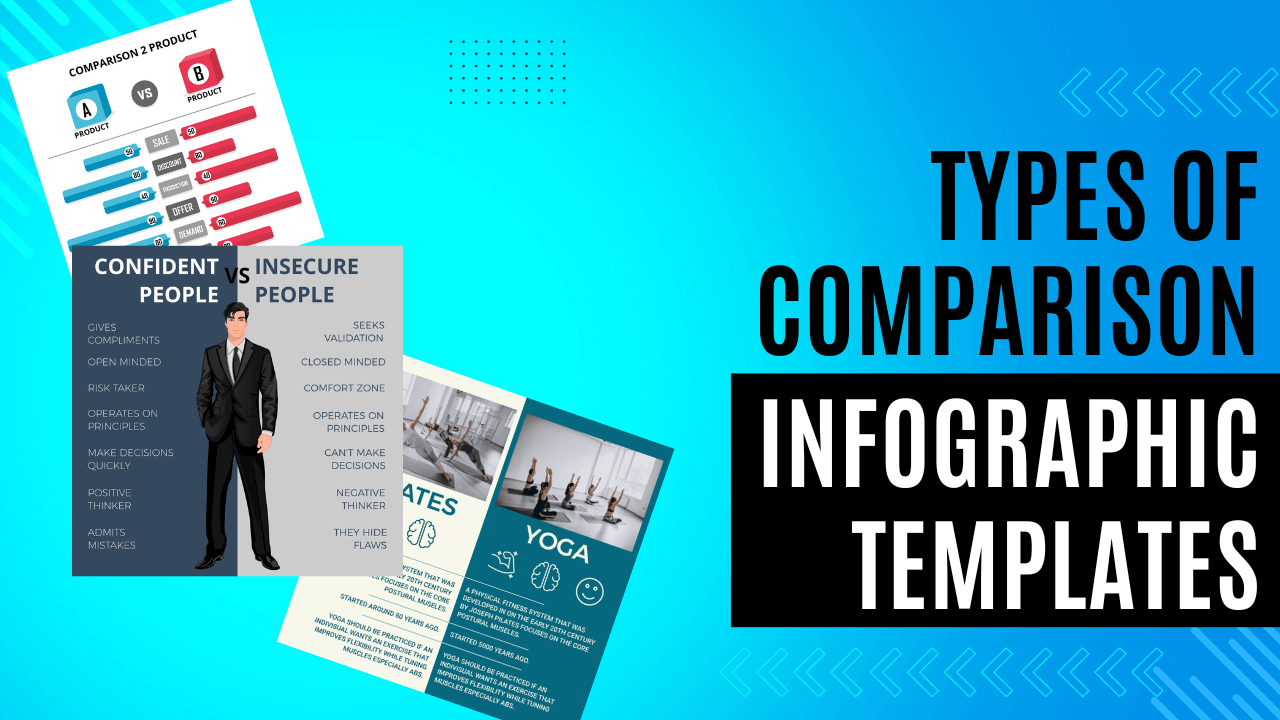
Side-by-Side Comparison
A classic approach, side-by-side comparisons present two subjects or concepts next to each other, allowing viewers to easily contrast key features.
Matrix Comparison
Utilizing a matrix format, this style excels in illustrating multiple attributes across several categories, providing a comprehensive overview.
Versus Comparison
The versus format adds a dynamic flair, framing subjects in direct competition, fostering engagement and emphasizing contrasts.
Feature-based Comparison
Focusing on specific features, this style breaks down complex information into digestible components, ideal for detailed analyses.
Pie Chart Comparison
Introducing a circular format, pie chart infographics offer a unique visual perspective, suitable for presenting proportional data.
Timeline Comparison
Chronological comparisons use timelines to showcase changes over time, perfect for historical and evolutionary analyses.
Flowchart Comparison
Visualizing processes and decision trees, flowchart infographics find applications in business and workflow scenarios.
Venn Diagram Comparison
Overlapping elements in Venn diagrams provide nuanced comparisons, ideal for representing complex relationships and intersections.
Bar Graph Comparison
Using bars for straightforward visual contrasts, bar graph infographics are excellent for representing quantitative data.
Radial Comparison
Circular infographics provide a holistic view of interconnected elements, offering a dynamic way to highlight relationships.
Pictorial Infographics
Incorporating images for comparative storytelling, pictorial infographics enhance visual appeal and audience engagement.
Geographic Map Comparison
Comparing data across regions, geographic map infographics are ideal for illustrating global trends and regional disparities.
Scatter Plot Comparison
Visualizing relationships between variables, scatter plot infographics are valuable for statistical and scientific comparisons.
Pyramid Comparison
Representing hierarchical structures, pyramid infographics are ideal for illustrating prioritization and organizational levels.
3D Infographics
Adding depth to visual comparisons, 3D infographics create immersive and impactful visual content.
Doughnut Chart Comparison
Similar to pie charts, doughnut charts provide a different visual perspective, emphasizing data proportions within a circular format.
Spider Chart Comparison
Also known as radar charts, spider chart infographics help compare multiple quantitative variables, showcasing strengths and weaknesses.
Bubble Chart Comparison
This dynamic format represents data points in bubbles, with size and color indicating different variables, suitable for multi-dimensional comparisons.
Flowchart Comparison
Visualizing processes and decision trees, flowchart infographics find applications in business and workflow scenarios.
Venn Diagram Comparison
Overlapping elements in Venn diagrams provide nuanced comparisons, ideal for representing complex relationships and intersections.
Bar Graph Comparison
Using bars for straightforward visual contrasts, bar graph infographics are excellent for representing quantitative data.
Radial Comparison
Circular infographics provide a holistic view of interconnected elements, offering a dynamic way to highlight relationships.
Pictorial Infographics
Incorporating images for comparative storytelling, pictorial infographics enhance visual appeal and audience engagement.
Network Comparison
Illustrating relationships between multiple interconnected elements, network infographics are ideal for showcasing dependencies and interactions within a system.
Gantt Chart Comparison
Utilizing horizontal bars to represent project timelines, Gantt chart infographics excel in displaying project schedules and progress over time.
Bubble Map Comparison
Overlaying bubbles on a map, this style helps compare data across geographic regions, emphasizing variations in size and color.
Heatmap Comparison
Visualizing data intensity, heatmap infographics use color gradients to highlight variations, making them effective for presenting large datasets.
Pareto Chart Comparison
Combining bar and line charts, Pareto charts prioritize elements based on frequency or importance, aiding in decision-making and resource allocation.
Word Cloud Comparison
Using visual prominence to display words, word cloud infographics compare textual data, emphasizing the frequency of terms through size variations.
Waterfall Chart Comparison
Showing cumulative effects of sequentially introduced positive or negative values, waterfall charts are valuable for financial and performance analysis.
Radar Chart Comparison
Circular charts with multiple axes, radar chart infographics allow for the comparison of data points across different variables, highlighting strengths and weaknesses.
Tree Map Comparison
Dividing data into nested rectangles, tree map infographics are effective in displaying hierarchical structures and categorical comparisons.
Diverging Stacked Bar Chart
Contrasting positive and negative values within stacked bars, this style is useful for illustrating the net effect of different components.
Sankey Diagram Comparison
Visualizing flow and relationships between entities, Sankey diagrams are effective for comparing proportions and magnitudes in interconnected systems.
Spider Web Comparison
Similar to radar charts, spider web infographics use a web-like structure to compare multiple variables simultaneously, emphasizing overall patterns.
Sunburst Chart Comparison
Circular hierarchical visualizations, sunburst charts are useful for illustrating hierarchical data and facilitating comparisons within a concentric structure.
Bullet Graph Comparison
Combining bar charts and reference lines, bullet graphs are excellent for comparing actual performance against target goals in a concise format.
Box-and-Whisker Plot Comparison
Displaying statistical distribution, box-and-whisker plots compare data ranges, medians, and outliers, aiding in data-driven decision-making.
Treemap Heatmap Hybrid
Merging the treemap and heatmap styles, this hybrid allows for a comprehensive comparison of hierarchical structures with intensity variations.
Choropleth Map Comparison
Employing color gradients on maps, choropleth map infographics visualize variations in data across geographic regions.
Bullet List Comparison
A straightforward textual approach, bullet list infographics present key points for easy comparison, suitable for simple and concise information.
Design Considerations
Effective comparison infographics hinge on thoughtful design. Carefully selected color schemes, fonts, and layouts contribute to visual appeal and comprehension.
Creating Effective Comparison Infographics
Crafting impactful infographics involves meticulous planning, from data collection to graphic design. Clarity and simplicity should be prioritized to ensure that the message is easily understood.
Real-world Examples
Analyzing successful comparison infographics provides valuable insights. Examining the design choices that captivate audiences can inspire and guide your own creations.
Common Mistakes to Avoid
Overcrowding with information, lack of clarity, and inconsistent design elements are pitfalls to steer clear of when creating comparison infographics.
How to Choose the Right Style
Tailoring your infographic to your audience, message, and content type is crucial. A deep understanding of these factors ensures that your message resonates effectively.
Future Trends
As technology advances, we anticipate exciting developments in infographic creation, opening new possibilities for engaging and dynamic visual content.
Benefits of Using Professional Services
For those seeking polished and effective infographics without the hassle, outsourcing to professional services guarantees high-quality design and content.
DIY Infographic Creation Tips
For the adventurous DIYer, we provide tools, resources, and a step-by-step guide to creating captivating infographics from scratch.
Conclusion
Choosing the right style for your comparison infographic is a strategic decision that can significantly impact your message’s effectiveness. By experimenting with different styles and staying attuned to your audience, you can create visuals that captivate and communicate with precision.


